Monday 30 January 2012

Digital Mock-up: Pop Heart Cover, Contents and Spread layout

COVER 


CONTENTS


DOUBLE PAGE SPREAD


COVER, CONTENTS AND DOUBLE PAGE SPREAD ANALYSIS:
I think this impression of my desired cover look to my magazine will appeal to my target audience of young adults between the ages of 16-24 as the interesting image of the cover will make them curious about my new music magazine. I used my three colour palettes of red blue and white to use as a house-style onto my contents page and double page spread. This consistant theme will give my magazine a balanced style to it and will also make this issue more recognisable on the market since the colours are all bold and compliment each other well. I chose for the central cover line that the 'X' in 'Sophia Fox' will be a descender to the other text as it is more feminine and connotates the signing of a kiss. I may have to adapt one of the three in the colour palette on my coverlines because the outcome of my image may have a different tone to it which I think will then match another colour such as red. This colour scheme will appeal to my primary audience of females as well as lesser male majority readers too because of the blue and red which can be considered unisex.

I chose the text within my contents to build around the image in the central third as it gives it a more stylish look and shows to my audience that my cover artist, Sophia Fox, is the unique selling point of this issue. I chose to have a heart implimented at the side of my masthead 'CONTENTS' to convey a cute feel to the magazine and will also appeal to my primary audience of females.

I used an italic font in lower case above my central title 'SOPHIA FOX' on the double page spread to set the context of the magazine. My columns will be initiated on both pages on the bottom half alongside one image of my cover artist to give balance and it will also be more simplistic. Also I will have my text black on the white background which makes it more appealing when reading and so my audience will not have any difficulty reading it.

Mock-up Photos: Magazine Cover, Contents, Article images


IN ORDER OF APPEARANCE:
1. High angled mid-shot
I like this image as it makes the person appear more innocent which would add more meaning to the picture. The high angle gives it a sense of depth and character which I really like. However I don't know if it will fit in with the sexy persona I will try to portray in my pictures rather than portraying my artist as an innocent character.
2. Wide-shot
This shot is one of my favourites as it gives the viewer a perspective and ratio to the image therefore adding more realism to the shot. This will also enable me to show the mise-en-scene of my cover artist and convey a confident character through her style of clothing. This will also be able to allow my audience to see the theme of the shoot more clearly.
3. Assymetrical mid-shot
This style of image makes the person in the shot look more rebellious as the assymetrical layout of the focus point suggests an inbalance in the situation. Therefore I don't think this would be appropriate for my magazine as my cover artist will not be rebellious but more conforming to stereotypical shots which were done during the 50s (which I want to convey).
4. Long-shot
I like this shot as it enables the person to be head to toe in the image so the mise-en-scene is fully shown. The portrait style allows the person to appear more stronger and confident in the image. It would also work in my contents page were I wish to have a long-shot ideally to show the entire clothing of my cover artist as well as demonstrate her sexy style.
5. High angled mid-shot with pose
This shot is slightly more high angled than other shots as it shows a proportion of the person knees. The centralisation that the person is aligned to gives the image a balanced look so the audience will not feel that it looks unsatisfying to the eye's first glance (hopefully drawing their attention to the article). I wish to have a shot like this on my double page spread to show my cover artist's personality through her choice of pose which will be more clearer if up close in a mid-shot.
6. Mid shot with close up
I like the landscape take of this mid-shot as it gives the image a more realistic look and a sense of situation. This mid-shot also allows the expression on the person's face to be more distinguishable which I could use to my advantage by allowing my cover artist to express her emotion through the image as well as the interview on the double page spread.
7. Landscape mid-shot
This is similar to the previous but I have made sure that the camera when taken is vertical with the wall. This is so it appears the audience are looking straight onto my cover artist and will be able to relate to them more. I think a shot like this would be more appropriate for largest image on the double page spread.
8.Mid-shot extreme close-up
The extreme close-up of this image make sure that the audience will focus on the artist's facial expressions. To improve this I think I would make sure that the camera is more vertical so that the shoulders are aligned with the head of the person, whereas this shot the shoulders are less visible due to a slight angle on the camera. I think I would use a shot similar to this on my double page spread as it will make my music magazine stand out against others and immediately draw the consumer into buying it.

Draft: Coverlines, Contents, Article

(These are subject to change when producing my magazine as it depends on the actual spacing and the size of the text in ratio to the size of my image etc.)

Coverlines:
The 60's inspiration | Chart Domination: The Year of the FEMALES | Sophia Fox Tributes Marilyn |This Month The Hottest Songs | Zac Efron Goes Solo

Contents:
On the cover:
- The 60's inspiration
- Chart Domination: The Year of the FEMALES
- Sophia Fox shows her Marilyn side
- The Hottest Songs
- Zac Efron goes solo

Music:
- The Wanted - up and coming
- 20 questions: Vincent Herbert
- Lana Del Rey the conquerer
- Reviews

In every issue:
- Charts
- TV & Entertainment Talk
-  Live events
- Online Opinions Corner: Twitter buzz

Features:
- HERE COME THE CURLS - Country star and global star Taylor Swift talks about her fourth studio album and talks her idols
-

Past and Present:
- Lady Gaga remembers Judy Garland
- Elvis Presley: How he paved the way for Pop
- Bing Crosby: Our favourite stars cover 'Young at Heart'


Double Page Spread Article

Artist Profile

Cover Artist Profile: Sophia Fox
My cover artist that will feature on my magazine 'Pop Heart' is called Sophia Fox. The artist writes and performs her own music that is mainstream pop and has several hits within the charts. She consistently reiterates the importance of her inspirations which helped create her music and her image, such as Marilyn Monroe and modern women who portray this like Christina Aguilera. Her artistry means a lot to her and has meanings behind several of her performances and takes care into how her music is portrayed to her audience. Her fans are typically females 16-24 who idolise her and listen to her music regularly. She also has a sex appeal to her male fans as she sexualises her image to exploit the trends of popular culture. Sophia Fox is age 23 with brown hair and styles her self accordingly, most well known for her cute a-line dresses and short skirts. Sophia was originally from North London in the UK where she developed her love for music during the early 90s. In my magazine she will adopt the style of her primary inspiration and independent woman, Marilyn Monroe and portray this through the misé-en-scene as well as the article. Sophia also plays a range of musical instruments like piano as well as guitar and regularly performs these on stage. She has duetted with her idol Christina Aguilera and has supported acts on tour like Paloma Faith as well as Lady Gaga. Sophia is a British act but derives a heavy influence from American culture to characterise her performances and give a unique look to her style.

Thursday 26 January 2012

Pitch: Evaluation


From my pitch I have found that I should use a specific typography that reflects the theme of my magazine. For example, I should use an Art Deco font perhaps within my double page spread which will reflect the era, this will appeal to my audience as it will tie in with the 50s pin-up inspired theme and stand out against conventional fonts. I feel that through the feedback process it was important to make my masthead stand out against other magazines. I will therefore conquer this problem by having 'POP' in a bubble/3D font and have 'HEART' in a sans serif font. I could also create the 'ea' to look like the shape of a heart and so will make my brand more recognisable.

I should also be careful to remain to focus on Pop but to not imply that it focuses on just pin-up artists of the past. I will do this my making my cover artist of modern pop music dress as a pin-up artist from which they are inspired, such as Marilyn Monroe, and the interview should focus on what inspired them from this era. The cover artist therefore will homage to their favourite artists during the 50s. Another issue which was not raised was the layout of my contents and I have decided I will have a long shot image of the cover artist in the central thirds of the page with the catergorised contents down the left-hand side shaped around the image.

I may also include outtakes of the photoshoot on the right-hand side to portray realism but I will see how it looks when I come to producing it. As well, I should not rule out my secondary audience of 25 years+ who will have a lesser percentage in my overall sales but should include mature and sophisiticated content to appeal to them as well.

I also presented my idea of a prop being the American flag in the style of a famous Marilyn Monroe picture which would cover my artist but I needed to be specific into whether it would then cover the clothing of the artist. To decide this I will carry out test shots to see what will be more appropriate.

The feedback to the title of my magazine 'POPHEART' was positive and would appeal to my young target audience of 16-25 years (females) as it is a cute name as well as not being exclusive to just present pop music but also past pop music.

Wednesday 25 January 2012

Magazine: Possible publisher IPC Media

'Which institution would publish your magazine and why?'

Personally I think my magazine would be published by IPC Media, who have a vast portfolio of magazines ranging from different genres. This variety of specialisation in magazines, ranging from Sport magazine, Gossip magazines and music magazine means that the publication of my magazine would not be a financial risk to the company. This is because their wide range of magazines such as 'NME' and 'Woman' suggests that IPC is a profitable company and can invest in new niche magazines. IPC Media is also a subsidiary company of Time Inc. (Time Warner) which has a large net income and so can invest in new ideas in order to expand their brand even more. IPC Media specifically publishes in the UK which I would like to aim my market at, but can also expand over seas if it becomes a popular magazine. 
Similar to my magazine, IPC Media publishes 'NME' which also has their own individual niche market of a young audience between 16-24 and has a specific genre they focus their music magazine on which is Indie/Pop. My magazine would have similar components but be aimed at the majority of female ratio, young adults between 16-24 with a lesser male majority and focuses on Pop music as well as past music and it's impact on modern day music. IPC would be interested in the publication of my magazine as it targets a niche market in which they have a variety of magazines which also target a specific audience and also because it challenges mass produced magazines so it offers unique content of past as well as present artists. This focus on both present day and past would be its unique selling point and would captivate their target audience and hopefully retain a regular readership.

Friday 20 January 2012

Pitch: Moodboard & Preparation


MOODBOARD 

Typical Reader Profile
My typical reader would be Beth Burrows who is aged 17 and is interested in the latest fashion and pop culture. She lives in middle England and is assertive in gaining information on latest media exclusives, such as interviews with celebrities, mainly pop artists. She prefers mainstream female artists such as Lady Gaga, Christina Aguilera and Beyonce who are independent women who have built a successful career for themselves. As well as mainstream fashion, Beth also takes inspiration from 1940s-60s pin up girls who have a unique sexy style and likes to see it incorporated into modern style, most preferably Christina Aguilera who adds a twist onto the pin up theme. Beth has a disposable income and likes to spend her money on magazines that offer unique information and has a innovative style. She takes inspiration from these artists and likes when they adopt certain themes in their magazine shoots, such as pin up or a candy theme. Beth also likes it when males are featured especially sex symbols such as Zac Efron or Channing Tatum. If a particular article fascinates her, she will also tell her friends or add feedback on the internet about the article. She also would also buy sucscriptions if a magazine appeals to her directly, her main preferences are Billboard and POP magazine; which provide inspiration as well as interesting content.

(a) Different title ideas

  • POPHEART - just the idea that pop music is loved by all
  • BEATS - Just relates to the music lexis of a beat within a song/normally the key structure in a song
  • MM - Stands for 'Marilyn Monroe' who was a symbol of women and a iconic singer of the time/also relates to style that is a 60s modern twist to it
  • ROLLER - relates to rollers which were a popular hair platform to style a woman in the past (and still is)/signifies the image of styling yourself and being who you want to be

(b) Variety of fonts you like

1. I like this font because of the decending letters which have a bubble-like shape to them. This gives the font a fun and also a retro look. It would looks good with effects such as shadows and a a gradient shine on the corners to give it a 3D look. This font also is similar to fonts used for pin-up posters used in the 40s-60s so I think it would be really complimenting to use it.
2. I chose this font out of my favourites as I admire to Art Deco style to it which relates to the theme of my magazine being inspired from the 1940s-60s.  The spacing also gives it a balanced look to the font and would compliment other fonts that have a close kerning.
3. This is one of my favourite Serif fonts as the curved lettering gives it a theatrical look and I think it would look better if it were all in capitals. This is so my magazine can stand out and I also think that there is no other fonts similar to this in the magazine industry at the moment.
4. I chose this sans serif font because I liked the elongated lettering which gives it an American appeal which I would like to be present in the theme of my magazine. It also emits a Western style to it which I like but I am not sure if it would fit the theme of my magazine.


(c) Colour pallettes
  • Light blue, red, white
  • Pink, red, white
  • Military green, red, white

(d) Ideas for content layout

  • A long shot image of cover artist/text down the left hand side and smaller images of outtakes on the right
  • or either 
  • A image in the middle of the page with text below in split colums/title above
(e) Ideas for your double page spread article
  • Interview with cover artist - Good Girl vs. Bad Girl (Public vs. Private life of the cover artist in the music industry)
  • Or an article about how iconic artists and sex symbols have shaped pop culture and pop artists today, such as Marilyn Monroe and Judy Garland, and how they continue to inspire.

(f) Who will be on your front cover? - style, costume etc and why


  • A female - an up and coming artist
  • A female - an up and coming artist paying tribute to their icon, e.g. Marilyn Monroe
  • She will have a pin-up style hair with short a-line dress (a colour that will match my desired 3 colour palette scheme) and heels with bright lipstick. It will be a modern pin-up style to fit in with the young women intended audience. 

Wednesday 18 January 2012

Audience: Research

Decisions made & evaluation
From my analysis of Q's magazines ideology and approach to audience appeal I have decided that I should create a music magazine that has a majority of a female to male audience. I think that this would be a profitable idea as no current magazine has that direct appeal or only reaches an even female to male ratio. Q magazine successfully creates a subtle male accustomed style and content, but does not excluse entirely their lesser female ratio. In comparison to this, I would prefer to take the opposite approach. Therefore I could feature content that has a primary appeal to women but still has mutual content that would interest the lesser majority of men. This could be achieved by using a unisex colour such as red, purple, white or orange to name a few within the cover. But still feature feminine orientated colours such as pinks, lavendars or pastels. These could still be complimented against bold colours such as black to maintain its universal appeal.

The style of my magazine would take inspiration from Billboard which attracts consumers of a mixture of female and males. The main image of my magazine would feature music artists, with a majority of icons that the audience can relate to and take inspiration from. Although my magazine could feature some males on the cover who have a sexual appeal to my audience who would be interviewed and discuss topics such as their music but also women which would entice my audience. My magazine would take a care in the vanity of its image but recreate and display the importance of independence of women and to go against the conformity that women are still faced today in society. Its lesser male majority would take interest in the musical contents of the magazine, such as reviews, releases, interviews as they would not be restricted to all-women content. The style of music would be based mainly on pop and music featured in mainstream charts as this has a mass audience appeal. Overall, my magazine will appeal to a mass audience but mainly directed at women.

Monday 9 January 2012

Magazine Cover and Contents & Preliminary Evaluation

PRELIM COVER:


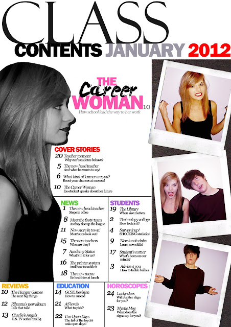
PRELIM CONTENTS:


1. What existing magazines did you look at for inspiration for your magazine? What features/conventions did you use?
For the cover of my preliminary magazine cover, I chose the style of my masthead based on my research into the construction of Billboard magazine. I needed a striking logo so I used similar kerning like Billboard logo where the lettering nearly touches one another; which spanned the full width of the page like RollingStone and Billboard. I found this enabled to catch the attention of browsers and draw the reader into the cover line topics which I formed into an 'F' model. My main cover line which featured the name of said person on the cover went across the torso on my main image which I took similarly from the style of Billboard magazine. Leaders were used to separate my cover lines which I took inspiration from RollingStone as I found it made it more distinguishable to read. I also took inspiration from my Billboard Contents page analysis where the text was constructed around a main image to give balance to the page and create a focus point of interest.


2. What skills have you learnt developed during your project? Be specific.
Production wise I have been able to develop further skills into Adobe Photoshop such as using the lasso tool to cut my image more accurately and giving my cover a professional look by having a plain background [white], the same technique used on majority of mainstream magazines. I have also been able to transform my text from defaults such as: using the kerning tool to move my lettering closer together to appear more appealing and widening the text so it spreads further across. Also, I learnt different adjustments to the appearance of imaging for example the use of 'Selective Colour' to pick a prominent tone to the image which could compliment other graphology like the text in terms of the three colour palette rule. In this case I could make the lips of my model increasingly red using the paint brush and layering above the image. In terms of analysis I have developed the skill of establishing the target audience from the use of colours, fonts, and spacing on a magazine cover.


3. What aspects of your Prelim work did you feel were successful
I think that my preliminary magazine cover was a success as I was able to apply my knowledge of previous magazine analysis by choosing a 3 colour palette rule; this has immediately made an impact making it appear professional and draw the attention of the reader. By not having one limited font colour it makes the cover appear bright and attractive to the eye; as well as balancing the cover lines rather than them being intrusive. I also think that my layout of my contents was successful as I used the reoccurring convention of my magazines and split topics under separate headings split between a table, giving the audience an easy pick-and-choose when browsing the magazine (rather than ordering them chronologically). 


4. What would you improve? Explain in detail.
For my cover, I would improve the font size of my cover lines as I do not think there was a wide variety of sizes to balance one another. I could then fill my cover lines that previous that would also be in proportion to my large mid-shot image. I also think I could use shapes to feature cover lines in to give variation into their importance in contrast with my main feature. My image could also be larger to cover the masthead more so that it shows higher significance. For my contents I could use only a certain area of the page for example only the central of the rule of thirds to give balance against the featuring images to appear at the bottom. I could also add more colour into the fonts in my contents as all the black numbers and writing appear to obstructive and confusing to look at and would put off a reader.


Tuesday 3 January 2012

Magazine Cover and Contents Sketches

Click image for larger view

Cover: (3)

NOTES:

  1. The first sketch (far left) is constructed using the 'F' model. Text is displayed over the central image with the masthead covering the image as well. A tag line at the bottom is also used to entice the reader into purchase.
  2. The second sketch (middle) is constructed using 'spiral' the model. The text is displayed to the further right of the cover in this case with spacing to the bottom and left of the rule of thirds to enable focus on the main image. This model allows the eye to move from the top left across the page to the bottom. The masthead is covered by the central image to suggest regular readership.
  3. The third sketch (far right) is constructed using the 'Z' model. The central image does not reach the masthead. Text is situated to the top of the rule of thirds, to the right middle, and then the bottom rule. This makes up the 'Z' which can allow more cover lines to be on show. I have chosen create this sketch but change it by making my main image overlay on the masthead which will add to the professionalism of the look. 


Contents: (3)

1. The first sketch (far left) is constructed using the 'F' model. The text for the contents features around a main image.
2. The second sketch (central) is constructed using the Spiral model. The text is based around a boxed image from the side to bottom and to left. It features extra pictures on the left.
3. The third sketch (far right) is constructed using the 'Z' Model. the text is entirely separated from the main image and heading.

All contents I decided to categorise the article names first and feature the page listing afterwards.