PRELIM COVER:
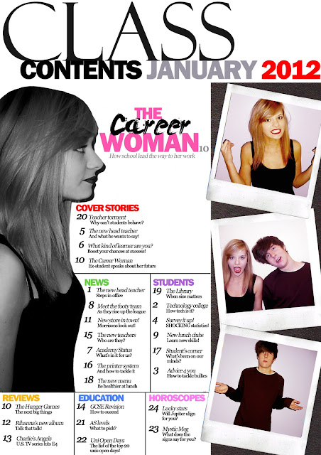
PRELIM CONTENTS:
1. What existing magazines did you look at for inspiration for your magazine? What features/conventions did you use?
For the cover of my preliminary magazine cover, I chose the style of my masthead based on my research into the construction of Billboard magazine. I needed a striking logo so I used similar kerning like Billboard logo where the lettering nearly touches one another; which spanned the full width of the page like RollingStone and Billboard. I found this enabled to catch the attention of browsers and draw the reader into the cover line topics which I formed into an 'F' model. My main cover line which featured the name of said person on the cover went across the torso on my main image which I took similarly from the style of Billboard magazine. Leaders were used to separate my cover lines which I took inspiration from RollingStone as I found it made it more distinguishable to read. I also took inspiration from my Billboard Contents page analysis where the text was constructed around a main image to give balance to the page and create a focus point of interest.2. What skills have you learnt developed during your project? Be specific.
Production wise I have been able to develop further skills into Adobe Photoshop such as using the lasso tool to cut my image more accurately and giving my cover a professional look by having a plain background [white], the same technique used on majority of mainstream magazines. I have also been able to transform my text from defaults such as: using the kerning tool to move my lettering closer together to appear more appealing and widening the text so it spreads further across. Also, I learnt different adjustments to the appearance of imaging for example the use of 'Selective Colour' to pick a prominent tone to the image which could compliment other graphology like the text in terms of the three colour palette rule. In this case I could make the lips of my model increasingly red using the paint brush and layering above the image. In terms of analysis I have developed the skill of establishing the target audience from the use of colours, fonts, and spacing on a magazine cover.
3. What aspects of your Prelim work did you feel were successful
I think that my preliminary magazine cover was a success as I was able to apply my knowledge of previous magazine analysis by choosing a 3 colour palette rule; this has immediately made an impact making it appear professional and draw the attention of the reader. By not having one limited font colour it makes the cover appear bright and attractive to the eye; as well as balancing the cover lines rather than them being intrusive. I also think that my layout of my contents was successful as I used the reoccurring convention of my magazines and split topics under separate headings split between a table, giving the audience an easy pick-and-choose when browsing the magazine (rather than ordering them chronologically).
4. What would you improve? Explain in detail.
For my cover, I would improve the font size of my cover lines as I do not think there was a wide variety of sizes to balance one another. I could then fill my cover lines that previous that would also be in proportion to my large mid-shot image. I also think I could use shapes to feature cover lines in to give variation into their importance in contrast with my main feature. My image could also be larger to cover the masthead more so that it shows higher significance. For my contents I could use only a certain area of the page for example only the central of the rule of thirds to give balance against the featuring images to appear at the bottom. I could also add more colour into the fonts in my contents as all the black numbers and writing appear to obstructive and confusing to look at and would put off a reader.


No comments:
Post a Comment